"It is better to see once than hear a hundred times" - this saying describes the essence of infographics very well. It has been shown that visual information is perceived much more easily than information we hear or read from a text. A picture can say a lot more and we can understand it much faster than what any other information channel can provide us with.
What are infographics?
Infographics are a graphical and visual representation of information, data or knowledge, which are intended to show complex information briefly and clearly. In other words, when we look at a table of numbers, we have to read and analyse them, then develop a picture in our minds of what the data want to show us. Infographics carry out this process for us and show us the picture for granted. Infographics show various trends or patterns, and the use of a connected text, graphics, and illustrations greatly facilitates the process of understanding the information offered.
Infographics are important because they change the way people find and process information, especially now, when they are increasingly entering and occupying a substantial part of the enormous amount of information that is poured out daily on the Internet. Let's face it - besides the fact that we always lack time, data presented in a tabular form, or even in the form of graphs, are boring. And when they are copious, we simply skip them. We pay attention to them only if we must read them. But even then, the effort to understand them is hardly insignificant. Infographics provide the same boring data presented in an interesting, and I would even dare to say entertaining, way. And since it seems that they will be around for a long time and we will encounter them more often, let's see where they come from and how they originated.
Roots of infographics
Various sources perceive various historical periods and archaeological sites or historical objects as the beginning of the graphic visual representations of information. One thing is certain and that is that long before writing appeared, our ancestors used drawings in order to show, transmit and preserve parts of their life and knowledge. In this early period of human evolution, we can hardly speak of art in the way in which we understand it today. Certainly, the informative nature of paintings in caves was highly significant. We could hardly declare firmly that these are pure infographics, but this shows where the above quoted saying came from - drawings are the first and most memorable way to transmit information. Perhaps, some 40,000 years ago, a proud hunter came home with a successful catch and wanted to tell the whole tribe what he saw and experienced? We cannot know for sure. The fact is that our ancestors felt a great desire to show their world in their paintings.
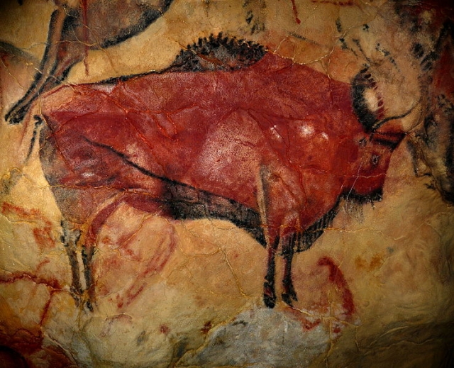
A drawing from the Altamira cave, known as the "Sistine Chapel of cave paintings"
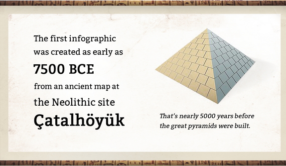
Time goes by and, together with human evolution, people’s ability to communicate also developed – they started being able to transmit not only what they saw, but more complex information as well. Diagrams and maps of areas and settlements appeared. Some sources indicate that the first infographic occurred some 7,500 years ago (5,000 years before the appearance of the pyramids), and it is preserved in Çatalhöyük.
Çatalhöyük is a well preserved ancient city of the Neolithic Era, which is located in southern Anatolia, which is now a part of Turkey.
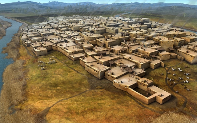
A reproduction of the entire city
There, a map was discovered, which is considered to be the ancestor of modern infographics.
Some 3,000 years ago, the Egyptians began to use hieroglyphic writing in order to tell stories from their lives related to various activities and beliefs.
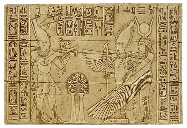
A combination of Egyptian hieroglyphic writing with a religious scene
Everywhere in ancient temples of ancient civilizations, we can see paintings which recreate things that excited their authors. In addition to the walls of temples, painted stories entered everyday life as well: vases, mosaic floors, decorated walls of homes, etc.
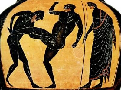
Antique fighters, a drawing on an amphora.
Myths and legends, legendary heroes, great generals and statesmen who are an ideal of human beauty and harmony, these are the stories that we learn from the archetypes of infographics. Recreated historical or mythological events are usually accompanied by an explanatory text - the names of heroes, gods and places.
Middle Ages and Renaissance
With the advent of Christianity, the style and themes of paintings changed and they became icons and murals that told stories of Christian saints and martyrs, as well as biblical fragments.
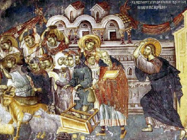
The "Cleansing of the Temple"
The beginning of the Renaissance was marked by the emergence of secular people in frescoes. Perhaps one of the earliest frescoes in medieval Europe is the one from the Boyana Church, which we introduced recently in an infographic about the Bulgarian cultural and natural heritage.

Sebastocrator Kaloyan and his wife Desislava
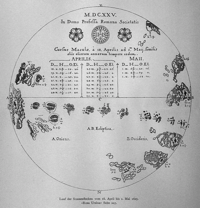
According to other sources, the first infographic appeared in 1626 and was created by Christoph Scheiner, a Jesuit and astronomer, who was one of the first to study solar spots. In his work "Rosa Ursina sive Sol" he provided a series of infographics related to "the movement" of the Sun:
The Industrial Revolution
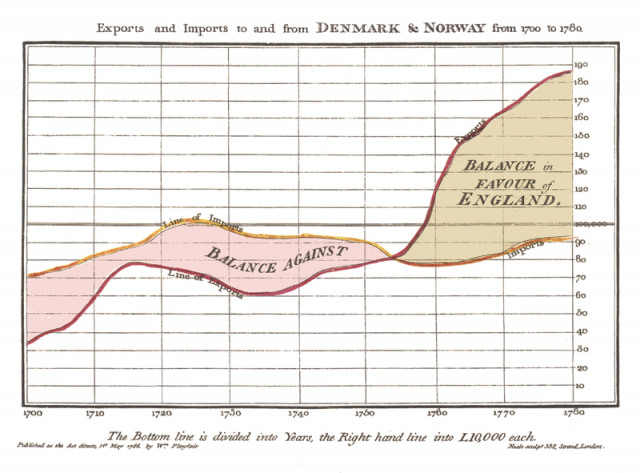
In 1790, William Playfair, an engineer and economist, published his first data-based chart. He did this in his book "The Commercial and Political Atlas." In order to represent the economy of England in the 18th century, he used statistical graphs using elements which we know from modern graphics - columns, lines, histograms, etc. In another work, he used a pie chart.
The graphical presentation of data quickly became popular, and it started being used in many areas of science - geography, medicine, natural science, the military sphere, and many more.
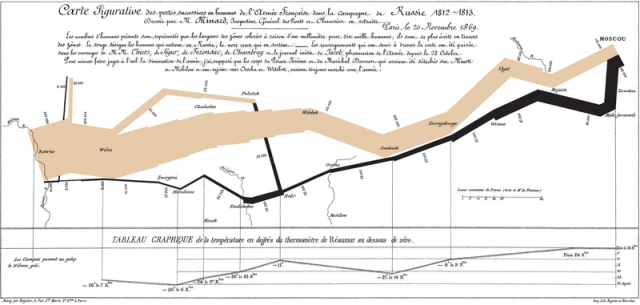
A representation of the advance of Napoleon in Russia by Charles Maynard
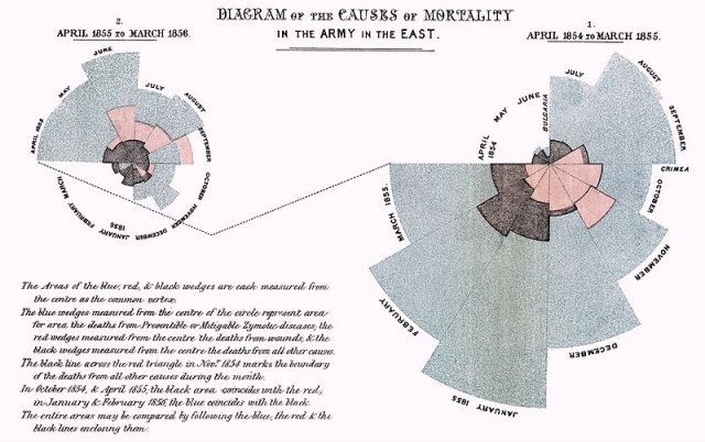
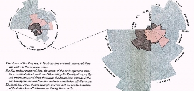
A diagram by Florence Nightingale that informs us about the causes of mortality among soldiers during the Crimean War. The diagram is part of her request to Queen Victoria, for the improvement of conditions in military hospitals. (1857)
The term "graphic" was used for the first time by James Joseph Sylvester in 1878 in order to reflect the relationship between chemical properties and mathematical data.
The 20th century
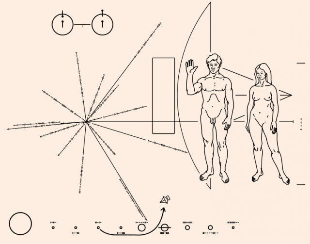
The rapid development of science introduced the use of graphics in every possible area. Examples are numerous. I will give an example that distinguishes this period from previous eras radically, and that is space exploration. An infographic was used on the first spacecraft which left the boundaries of our solar system - Pioneer 10. A plate of information was put on board in order to indicate, in the case of a possible encounter with an alien intelligent race, the location of our planet and the fact that there is intelligent life on it.
Modern times
The advent of the Internet as a medium of communication led to a rapid development of infographics. The technologies used in them are many and various: Adobe Flash, HTML 5, CSS, various programming languages. The graphic part is entrusted to experienced designers who recreate various types of information in interesting illustrations. There are processed data behind the visual side of infographics. Making infographics is not an easy process. As can be seen, it involves professionals from various fields. In major news agencies and websites, teams responsible for making infographics may consist of several dozens of people. There are companies that specialise in the manufacture of this type of content.
Due to its complexity and growing popularity, specialised literature, aimed at both developers and designers, journalists and statisticians, already exists.
However, the development of technology enables even non-specialists to create beautiful graphics. Sites like Infogr.am, Piktochart and Easel.ly assist in the complex task of making good infographics. They include templates and have the ability to display data from a table. However, this will not save you the necessary task of collecting and processing data or finding appropriate images, but it helps from a technical point of view.
Infographics, created by our team, can be seen in our section "Figures and Facts".


